Today we’ll take a look at Yocto.

Mapper: Pevel
Version: beta 1
Status: released
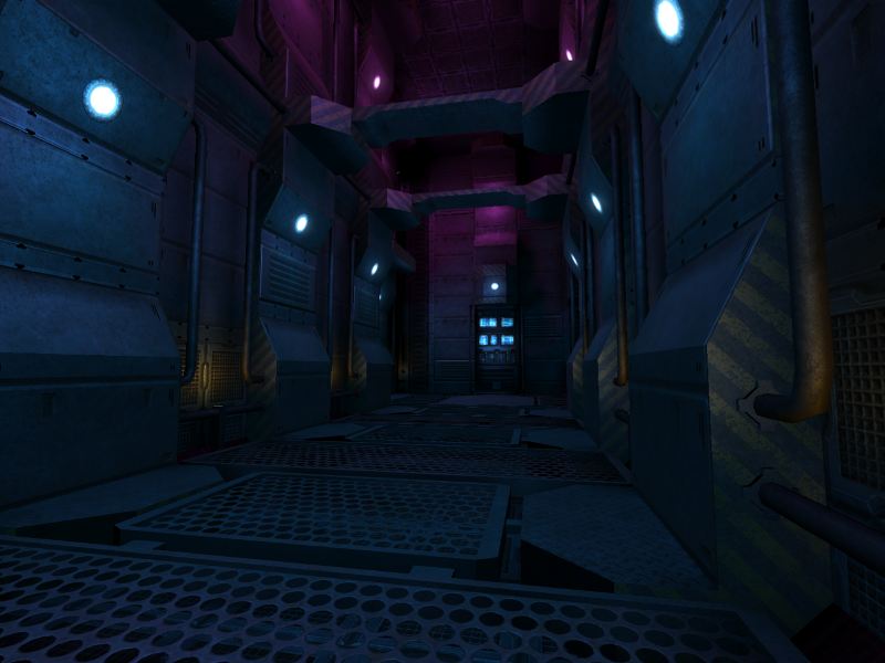
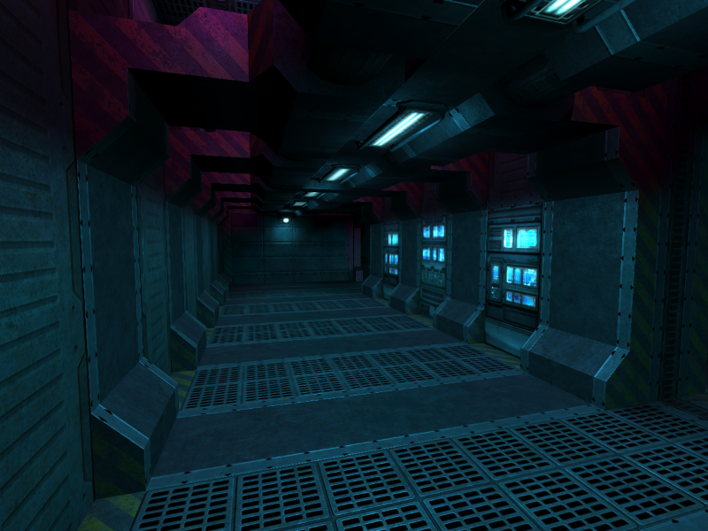
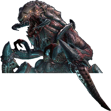
Fulfilling a need for smaller maps, Yocto has a decidedly condensed layout, although not without its fair share of twists and turns and dark, spooky corridors. Designed by Pevel, whom you may remember for creating Tremulous maps like Perseus, Yocto continues in his tradition of eerie, somber maps in the form of an abandoned underwater research station. The few visible windows on the map all provide the viewer with a glimpse of the expanse of deep, lifeless blue stretching off into the distance, further enforcing a feeling of isolation and leading to the map feeling decidedly claustrophobic. Both teams start off in the largest rooms on the map, and these are connected by narrow hallways packed with ventilation ducts, sudden drops, and dead ends. The map as a whole is poorly lit, with the sole sources of light mostly taking on blue and violet tones. Aliens have plenty of dark corners to hide in, while humans need to tread more carefully and travel in groups.

The map itself has been in a stable state for nearly a year now, and this likely will not change, barring any engine improvements or renderer features that would necessitate a repackaging or recompilation. In terms of layout, there isn’t much to change with it, as the goal of the map is to strike a balance between small size and complex gameplay in contrast to older Tremulous maps like ATCS and Nano, both of which were symmetrical. However, we’re still open to comments, which we’ll gladly pass on to Pevel after he returns from his mapping hiatus. What do you think of Yocto? Is there anything you’d like to see changed on it? How do you feel about the darkness of the map?

